Brochure design in a digital first world

Brochure design remains a potent tool even as screens dominate our attention. I’ll show you how to craft print collateral that stands out, gets read, and drives action — by combining classic design principles with smart digital integration. Expect practical tips on layout, visual hierarchy, print marketing tactics and calls to action that bridge paper and pixels.
Why print marketing still converts
The advantage of tactile attention
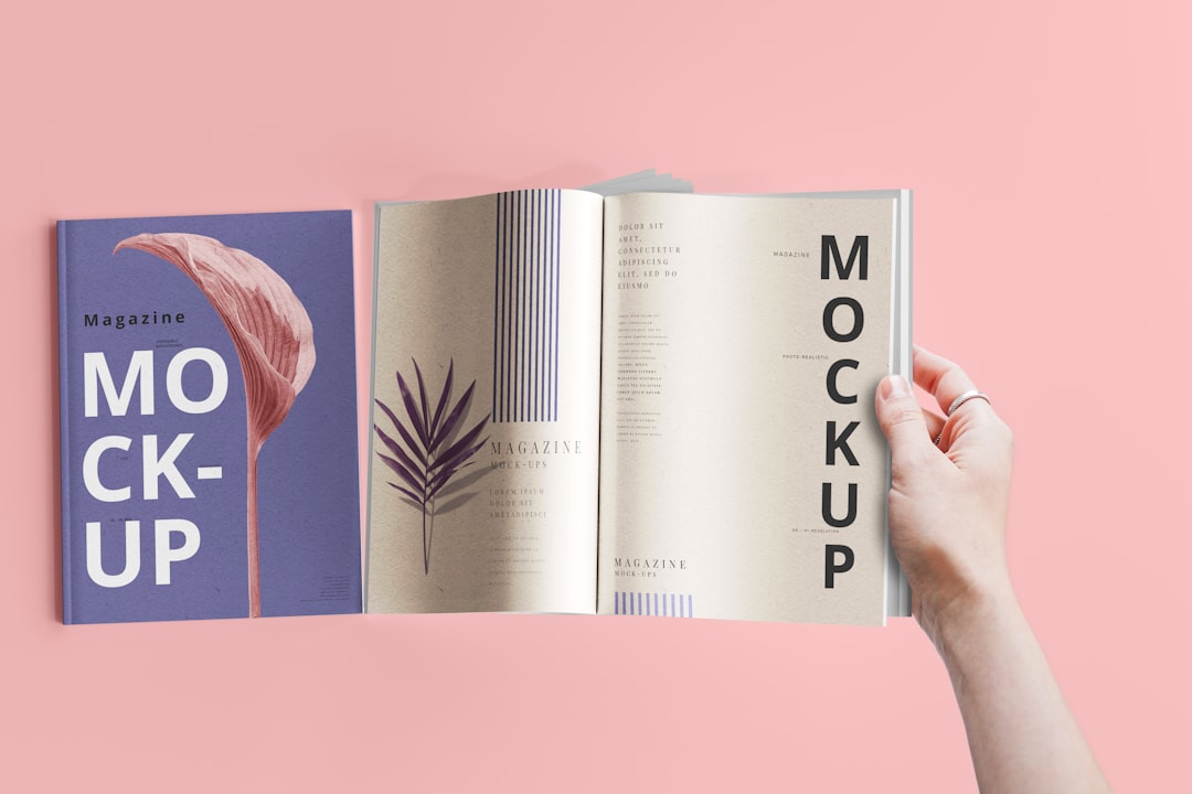
A physical brochure interrupts the endless scroll. When someone holds your piece, their attention span lengthens and memory retention improves. I often recommend using a unique fold or paper texture to create a small ritual: unfolding, touching, reading. That ritual makes your message stick.
Building trust and perceived value
Well-produced print signals care and permanence. A sturdy stock or a tasteful finish communicates brand credibility at a glance. For example, luxury services often pair minimalist layouts with uncoated paper to imply sophistication; nonprofits use high-quality brochures to show stewardship of donations. Choose materials that align with your message.
Layout techniques for maximum readability
Use grids and generous white space
A clear grid system brings order to content and speeds comprehension. I advise starting with a modular grid (columns and gutters) so every element aligns. White space isn’t wasted — it creates breathing room and highlights priority items. Keep margins consistent and avoid crowding text and imagery.
Typography that guides and comforts
Select a readable body font and pair it with a stronger display face for headings. Large x-heights and generous leading improve legibility on paper. Limit font families to two or three. Use weight, size, and color to create a typographic hierarchy that matches the brochure’s scanning patterns.
Creating a strong visual hierarchy
Contrast, scale, and focal points
Visual hierarchy is the choreography of attention. Use contrast — bold type, color accents, or image scale — to establish focal points. A single large image or bold headline should anchor each spread. I often recommend 70/20/10: 70% supporting content, 20% focal visual, 10% call to action.
Sequencing content for fast scanning
Readers scan before they read. Lead with a compelling headline, follow with a one-sentence value proposition, then a short supporting paragraph. Bullet lists and icons speed comprehension. Make the primary message readable at arm’s length and the CTA impossible to miss.
Calls to action that get responses
Clear, measurable CTAs
A brochure needs a simple, direct ask. Replace vague lines with actionable verbs: "Book a free consult", "Claim your 20% pass", "Scan to RSVP". Offer-specific CTAs convert better than generic ones. Include time-limited incentives to create urgency, and state benefits clearly.
Bridging print and digital for tracking
Combine tactile appeal with traceable digital pathways. Use QR codes, short custom URLs, or unique promo codes to route responses and measure ROI. For broader campaigns, embed UTM parameters for web tracking. I advise testing both QR placement and size: make it big enough to scan easily and pair it with a short instruction.
Production, budget, and sustainability choices
Choosing paper, finishes, and print techniques
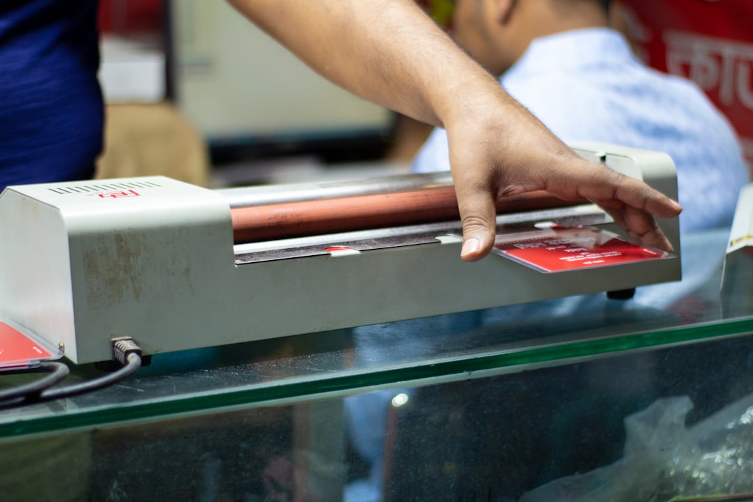
Paper weight, coating, and finishing choices shape perception. Matte coatings reduce glare and read comfortably; spot UV highlights draw the eye; embossing adds tactile luxury. Balance aesthetics with cost: consider hybrid strategies (heavier stock for the cover, lighter inside pages) to control budgets.
Cost, distribution, and ROI planning
Targeted distribution multiplies returns. Focus mailings on high-value lists or hand out at curated events rather than mass drops. Track responses by segment to calculate cost-per-acquisition. I recommend small test runs to validate design and messaging before scaling production.
- Focus on one primary message per brochure.
- Use a consistent grid and maintain generous white space.
- Prioritize a strong typographic hierarchy and readable fonts.
- Make your CTA specific, urgent, and trackable.
- Integrate QR codes or custom URLs for measurable results.
- Test materials and distribution in small batches before full print.
Brochure Design Wrap-Up: Key Steps to Boost Readability and Response
I encourage you to see brochures as a sensory handshake — an opportunity to start a relationship, not just convey information. Aim for a clean layout, a compelling visual hierarchy, and a single clear call to action that connects to measurable digital outcomes. By pairing thoughtful material choices with smart tracking and targeted distribution, your print collateral will not only be read but acted upon. If you want, I can review a draft layout or suggest CTA copy tailored to your audience.
For concrete examples of brochure production, finishing options and print-to-digital tracking in action, see clear22.co.uk.


